Flexbox is a great way to easily distribute elements and empty space in a row or a column, and create interesting layouts.
It only takes a couple of CSS properties to create nice layouts that automatically adapt to the available space.
But, all of this power also means that the complexity that the browser engine deals with is hidden from you, the developer. While this is, in general, fine, it tends to become an issue when your flexbox layout isn't doing the things you want it to do.
If you've ever used flexbox, there might have been times when you've wondered: why is this element this big?, or why is this element not growing to fill that gap?
Firefox has a wonderful tool that can help with this.
- Right-click on the flexbox item that you're interested in and select Inspect.
- DevTools opens up, and the Inspector tool is displayed, with the corresponding element selected.
- Click Layout in the Inspector sidebar.
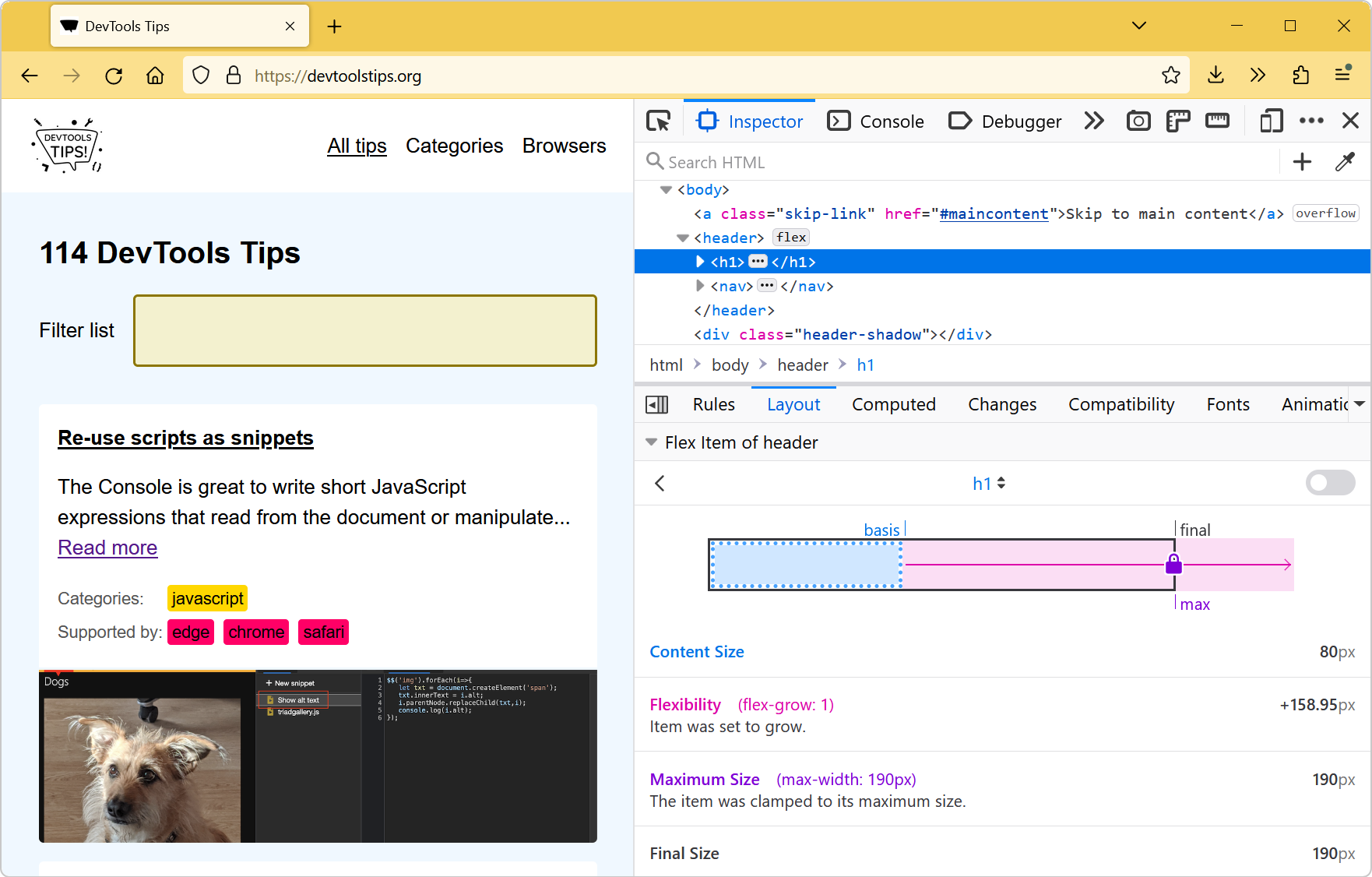
You now have a diagram that represents the size of the flex item, with some annotations that might be useful for understanding why this particular item has been sized this way.
Here is the information that might be displayed:
- Content size: the size the flex item needs to display its content.
- Base size: the size that corresponds to the
flex-basisproperty (orwidthin row direction, orheightin column direction). That's the base size that you wanted to give to this element, before any shrinking or growing happened as part of the flexbox layout. - Flexibility: whether the item grew or shrank and by how much. Note that this can also mean how much the item wanted to grow or shrink, but it might not correspond to the final size. See below.
- Max or min size: whether the item has a max or min size defined (e.g. using
min-widthormax-widthin row direction). This can clamp the item, even if it wanted to grow or shrink more. - Final size: the actual final size of the item.


